
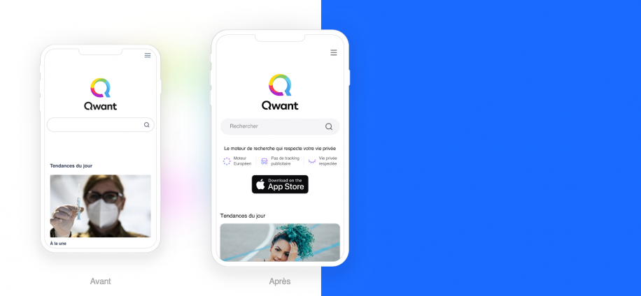
As you may have noticed, in 2021 Qwant wanted to refocus on mobile usage through a new, more attractive and modern interface.
Since March 23, we have been gradually rolling out a new design in Canada, France and other countries. This new version of Qwant is the result of extensive work by our teams and is based on user feedback to better meet your expectations. Indeed, with more than half (51%) of French users now connecting to the Internet via their mobile phone, it seemed essential to us to adapt to this reality. So what’s new in this new version? The answer in this blog post!
As you know, at Qwant, we put our users at the heart of our concerns and our products. To meet today’s needs, this new version has been designed above all for use on mobile.
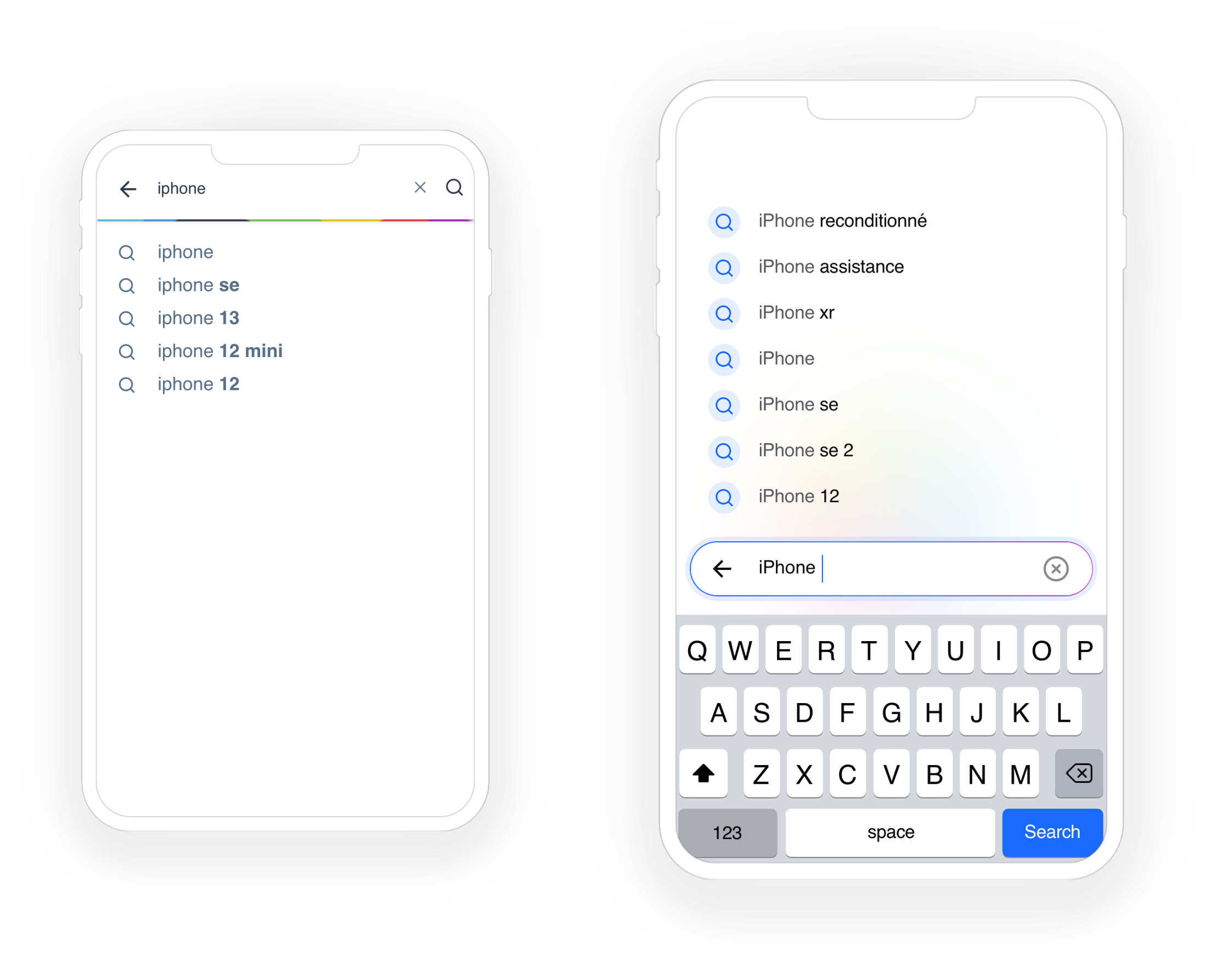
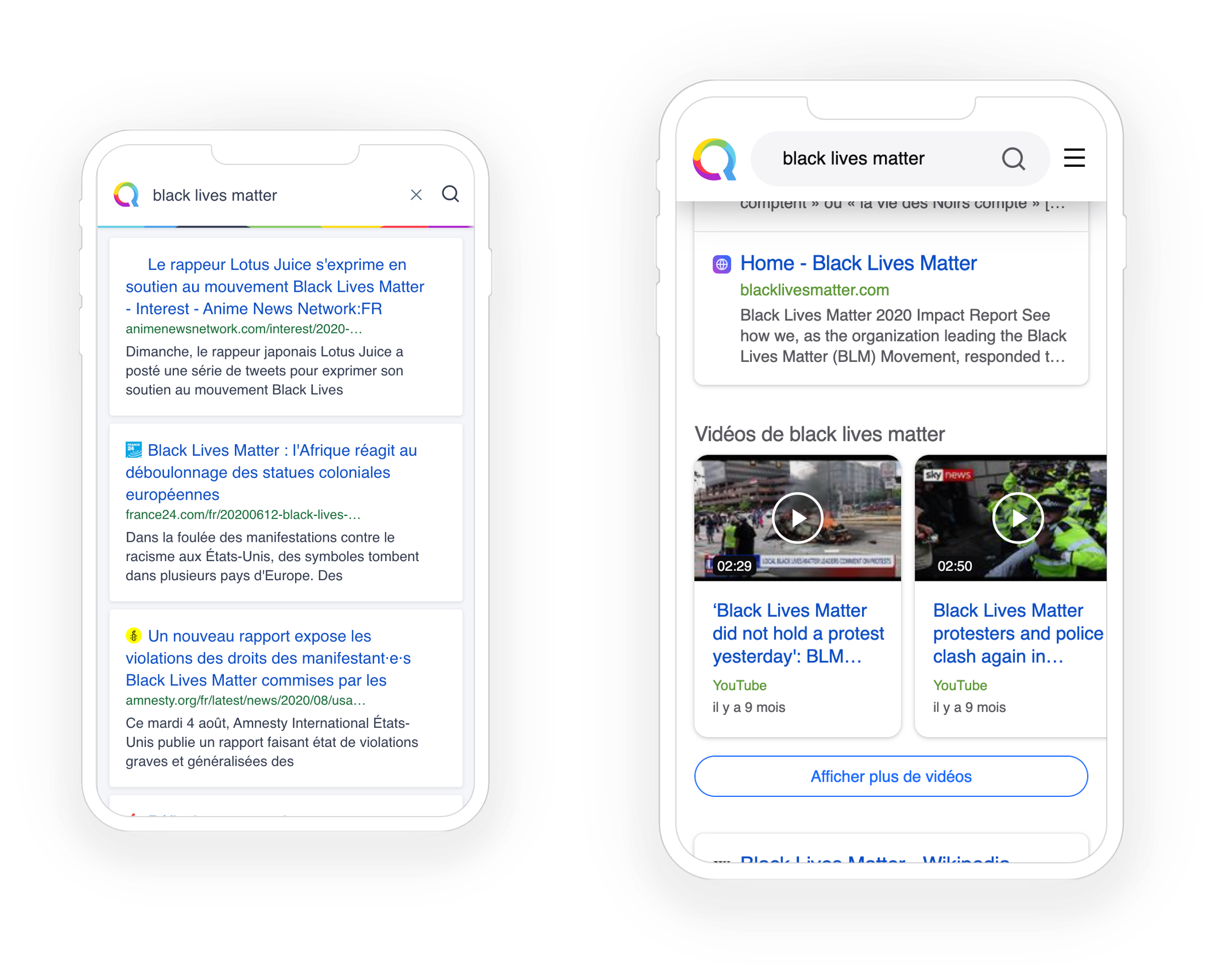
For example, the search field is now within reach of your thumbs, at the bottom of the screen on mobile. The display of search suggestions is also reversed, with the most relevant suggestions closer to the user’s thumb. The design of the suggestions is more airy and allows for more results to be displayed while maintaining clarity. In short, the new interface is light and rich!
Another design change for a better user experience: the results page is easier to read. White results on a white background and content separators make it easier to read.
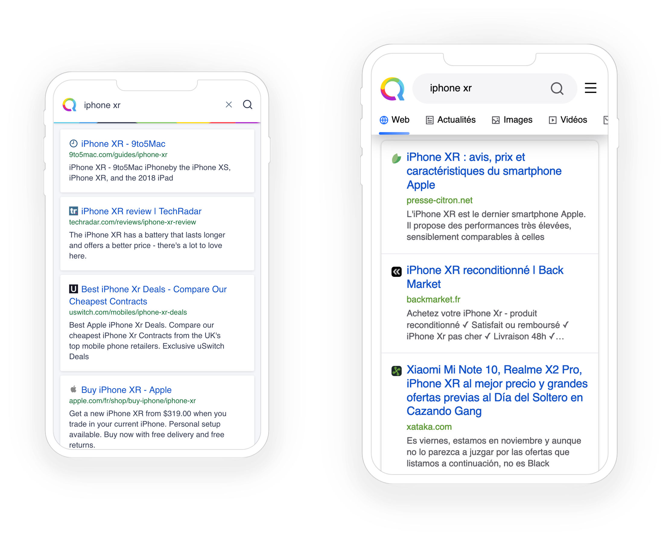
Finally, what we expect most from a search engine is to have the answer to our queries. Our teams have developed instant answers thanks to a catalogue that is growing every day.
In addition, the work on intention detection will enable us to enrich the results pages, in particular through the redesign of the various complementary modules such as instant answers, advertisements and content injections, in order to offer an ever more relevant experience to our users.
Underneath the interface, everything changes. We have chosen to start afresh with, among other things, the use of React technology, which will now allow us to develop the product in a more collaborative way, facilitating A/B testing, updates and the modularity of new features. This new version is the result of a long-term effort by Qwant’s experienced teams. It is one of the first waves of improvements and reflects the major efforts underway to overhaul the search engine’s technology.
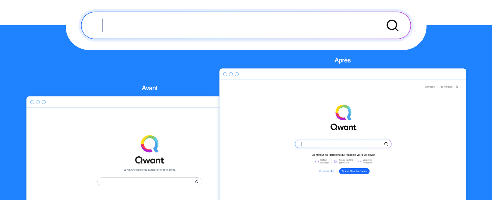
In this new version, our design teams have opted for a new electric colour palette. This now illuminates the search bar.
More dynamic, this electric blue as the main action colour makes the interface more intuitive. Aesthetic and warm gradations, used sparingly, also facilitate certain actions for the user.
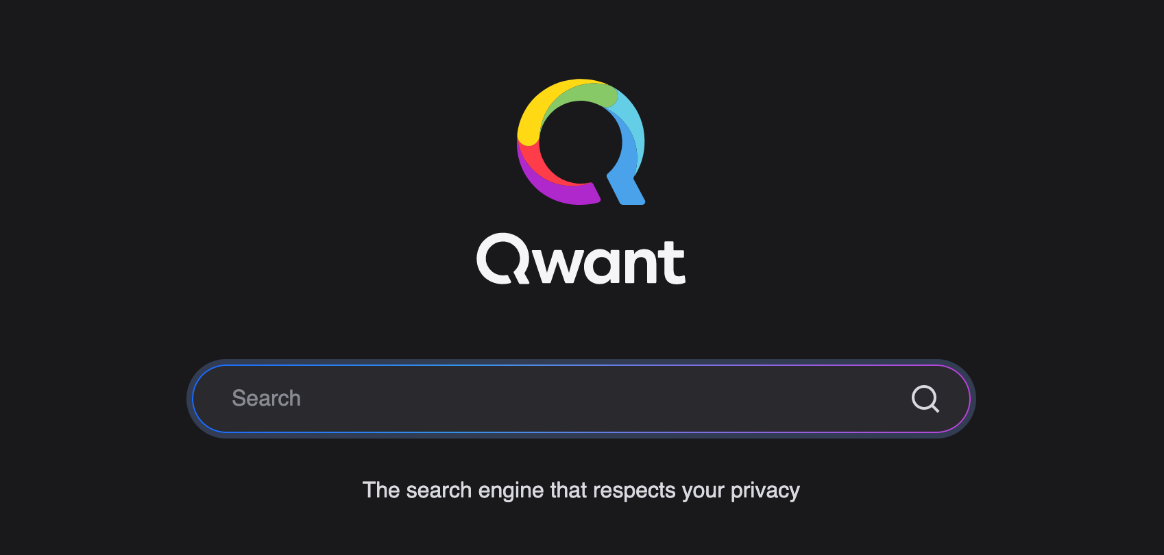
This new design is also deployed in the dark display mode. Depending on their preferences, users can now choose between light and dark mode. Are you more of a team dark or team white?
Nothing has changed in terms of content! Respect for privacy, protection of personal data and promotion of an ethical, neutral and panoramic web are the foundations on which Qwant has been based since its launch. These values remain at the heart of Qwant’s development to provide users with an ever more efficient and responsible search engine!
As Jean-Claude Ghinozzi, our President & CEO, says, “Qwant.com’s content will grow exponentially in the coming months and become increasingly relevant. I am happy and proud of the work accomplished by the teams over the past year. What is done on the inside can now be seen on the outside! “.
These changes to the user interface are just the first step in building a more relevant, mobile-first and user-friendly Qwant. So with all these arguments, do you want to try this new Qwant.com?
