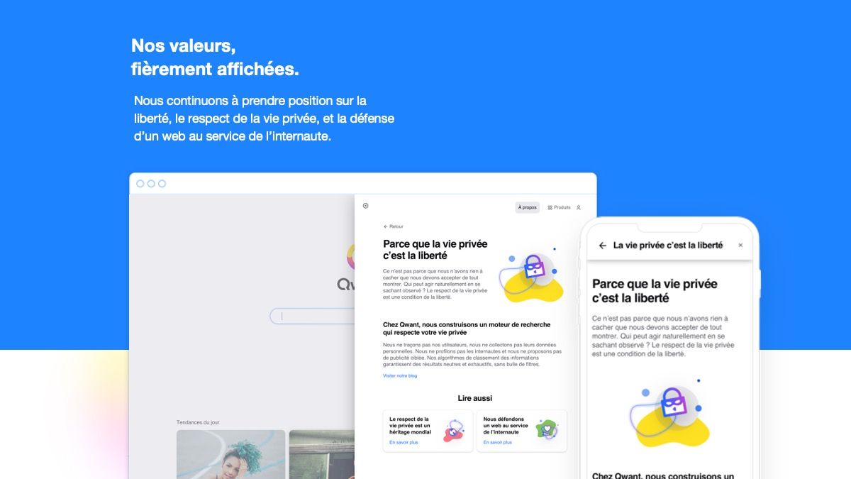

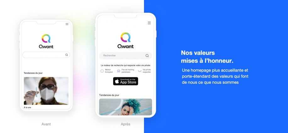
Some of you have surely noticed, Qwant wanted for 2021 to refocus on mobile use with a new interface more attractive and modern.
Since March 23, a new design has been gradually rolled out in Canada, France and other countries. The result of the long work of our teams, this new version is based on user feedback to better meet your expectations. Indeed, with more than half (51%) of French users now connect to the Internet through their mobile and it was essential to adapt to this reality. But then you will tell me, what changes in this new version? The answer in this article!
As you can see, at Qwant, we put the user at the heart of our concerns. To better meet current needs, this new version has been designed primarily for mobile use.
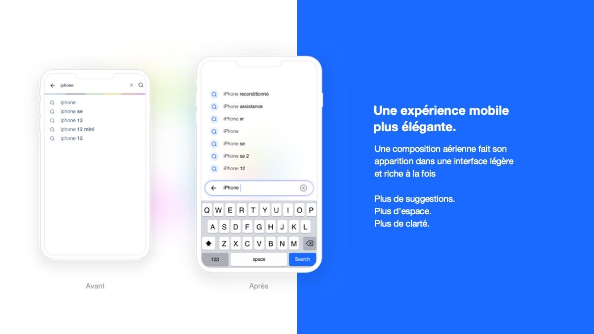
An example? The search box is now at your fingertips, at the bottom of the screen on mobile. Search suggestions are also reversed with the most relevant proposals as close as possible to the user’s thumb. The design of the suggestions is more airy, which allows to display more results but to maintain some clarity. In short, a light and rich interface at the same time!
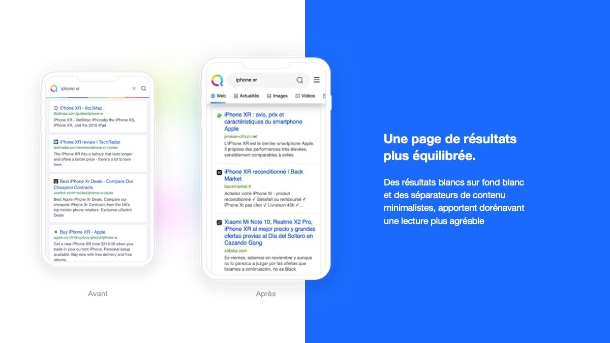
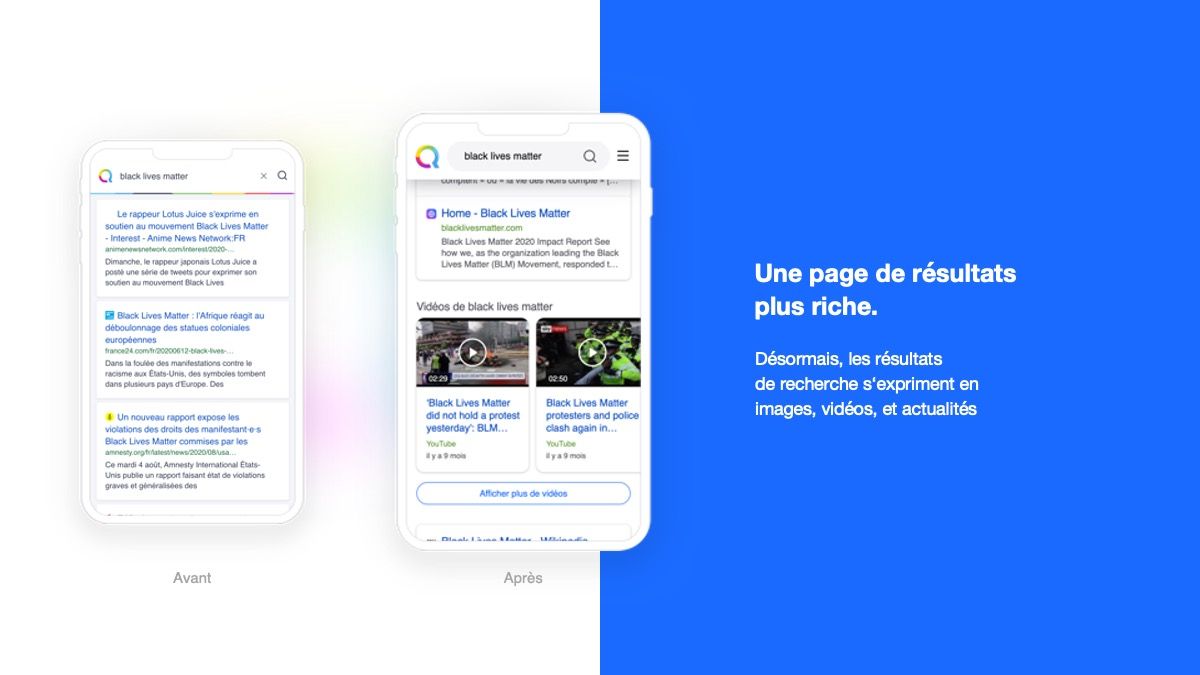
Another change allowing a better user experience: reading the results page is easier. White results on a white background and content separators make reading more enjoyable.
Finally, what we expect from a search engine is to have the answer to our queries, right? For this, our teams have developed instant answers thanks to a catalog that grows from day to day.
In addition, the work on intent detection will make it possible to enrich the results pages, in particular through the redesign of various add-ons such as instant responses, advertisements and content injections to offer an ever more relevant experience to our users.
Under the interface, everything changes. We have chosen to start again on a new basis with, among other things, the bet of React Technology which will now allow us an increased collaborative evolution in the product facilitating A/B testing, updates and modularity of new features. This new version is a long-term work carried out by Qwant’s distinguished teams. It is one of the first waves of improvements and reflects the significant efforts underway on the technological redesign of the search engine.
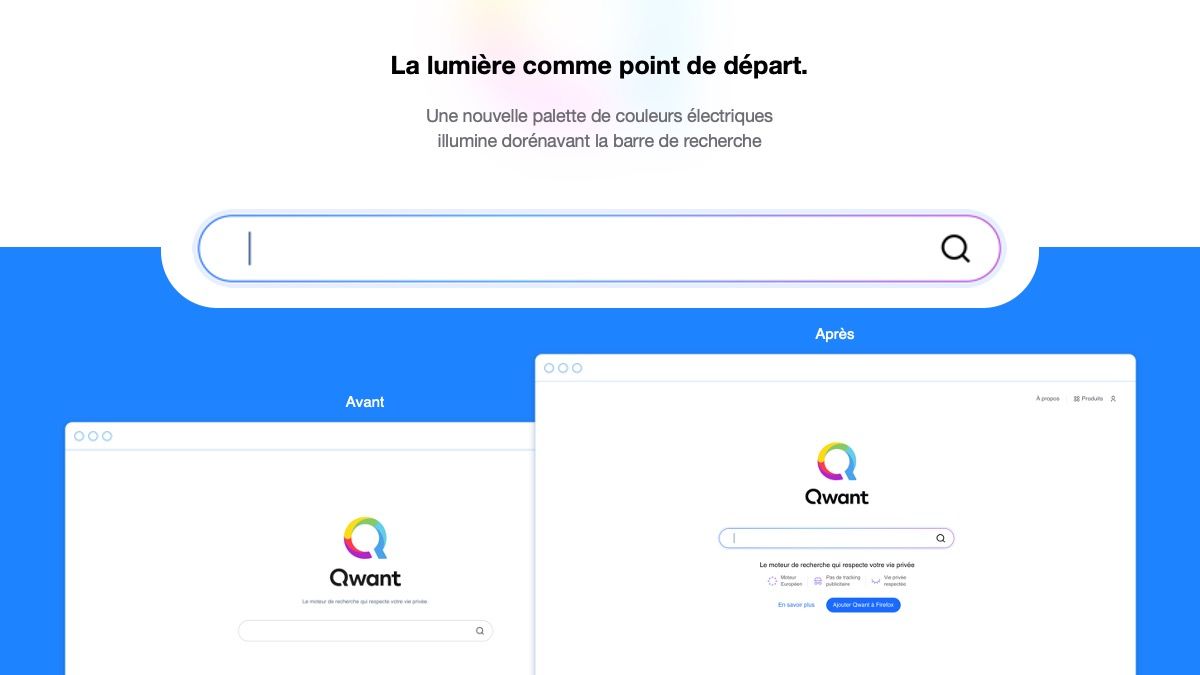
In this new version, our design teams have opted for a new electric color palette. It now illuminates the search bar.
More dynamic, this electric blue in main action color makes the interface more intuitive. Aesthetic and warm gradients, used sparingly, also facilitate certain actions for the user.
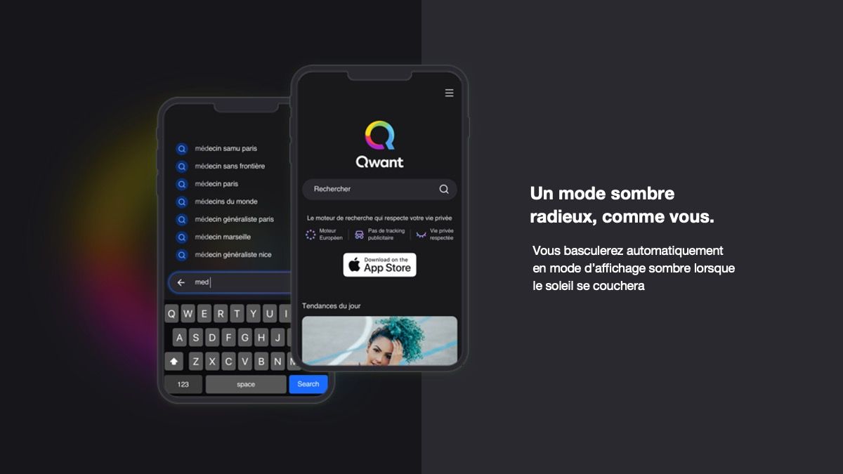
This new design also unfolds in the dark display mode. Depending on their preferences, the user can now choose light or dark mode. So, are you more team dark or team white?
Basically, nothing changes! Respect for privacy, protection of personal data and promotion of an ethical, neutral and panoramic web, these are the foundations on which Qwant has been based since its launch. Values that remain at the heart of Qwant’s development to provide users with an ever more efficient and responsible engine!
As Jean-Claude Ghinozzi, our President & CEO says., “The content of Qwant.com will thus be able to enrich exponentially in the coming months and become more and more relevant. I am happy and proud of the work accomplished by the teams for more than a year. What is done inside is now seen outside! ».
These changes to the user interface are only a first step to build a more relevant, mobile-first and ergonomic Qwant. So with all these arguments, do you want to try this new Qwant.com?
